当 WEB の大改修 第三弾
12月
8
2025
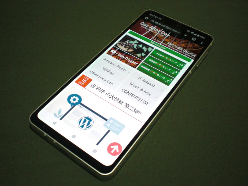
今回の大改修は今まで中途半端になっていたスマホ対応について、ちょっと踏み込んでみた。その時のなるほどテクニックのメモである。
PCでの表示ソース(前回までに改修済み)をそのままに、CSS の変更だけで PC とは全く異なるスマホ用レイアウトにする場面で、今回もかなり ChatGPT(無料モード)にお世話になった。ここでメモっている「なるほどテクニック」は、そのアドバイスの内、実際に当ブログに使わせて戴いたものの抜粋である。
目次
幅が限られるため非表示にするテクニック
- PC ではセンターにブログ本体を表示し、左右にメニューバーを表示していた。
これを非表示にして、スマホ専用に再構築したメニューバーを新たに作成、PC ではそれを非表示にすることでレイアウトを変更する。
index.php
<!----------------------------- モバイル専用メニュー(PC非表示)------------------------------>
<div class="mobile_menu_area">
    <?php
        if (function_exists('mobile_menu'))
        {
            mobile_menu();
        }
    ?>
</div>
CSS (PC用)
/* モバイル専用メニュー(非表示設定)*/
.mobile_menu_area {
display: none;
} CSS (Mobile用)
/* 左側ペイン指定 */
div.body_left {
display: none; /* 非表示 */
}
/* 右側ペイン指定 */
div.body_right {
display: none; /* 非表示 */
}
line-height の指定の仕方
- line-height は特別な場合を除いて px で固定しない方が良い。
- &li;ruby> が振られた行の line-height を高めに設定したい。(期待どおりにならない)
- どう書くのが理想か
その理由は次のようなケースに悪影響を及ぼす。
CSS
h1 {
    line-height: 30px;
}
h1:has(ruby) {
    line-height: 1.5;
}
CSS
h1 {
    font-size: 24px;    /* 絶対値としてのサイズは文字を基本にする */
    line-height: 1.2;   /* 1.2em と言う定義はせず単に倍数を指定 */
}
h1:has(ruby) {
    line-height: 1.6;   /* ルビ有りの場合のみ高さを増やす */
}
wrapper がセンタリングしている場合、その内の特定ポイントを指定する
- CSS で次のように指定する
- relative 指定された wrapper の中で absolute 指定の class="text-pos" を指定する
CSS
.wrapper {
    width: 800px;
    margin: 0 auto;         /* センタリング */
    position: relative;     /* この定義で位置指定が可能になる */
}
.text-pos {
    position: absolute;
    top: 120px;             /* wrapper 内の上から */
    left: 200px;            /* wrapper 内の左から */
    font-size: 20px;
} HTML
<div class="wrapper">
<div class="text-pos">文字列</div>
</div>オーバル型ボタンと左右ボタンの線による連結
- イメージで作成していたオーバル型ボタンのCSS指定
- ボタン指定を左右分作成し、左右に有る場合その間をラインで結ぶ
CSS
    /* ボタンの表示 */
    .right_button {
        margin-top: 5px;
        margin-bottom: 15px;
        margin-left: 5px;
        background-color: #888888;
        color: #dddddd;
        float: right;
        font-weight: bold;
        height: 22px;
        width: 100px;
        text-align: center;
        line-height: 1.1;

        /* 追加:角を丸くする */
        border-radius: 20px;        /* 値を大きくすると丸くなる */

        /* 内側のオーバル枠(ここがポイント) */
        box-shadow: inset 0 0 0 2px #999;
  	}
CSS
    /* 左右にボタンが有る場合、2つのボタンを線で結ぶ */
    .button-line {
        display: flex;
        align-items: center;
    }
    /* 2つのボタンをつなぐ線 */
    .line {
        flex-grow: 1;             /* ← 空いたスペースをすべて埋める */
        height: 1px;              /* 線の太さ */
        background: #888;         /* 線の色 */
        margin: 0 0 8px 0;           /* ボタンとの間隔 */
    }
元動画から右僅かが欠け左側に回り込む現象有り対処
- mpeg(mpg) ➡ mp4 に変換したら表示する様になったが表記の問題が発生
- 動画ページが表示した時点で自動再生
HTML
<div style="width:480px; height:auto; overflow:hidden;">
    <video controls style="width:105%; margin-left:-10px; height:auto;">
        <source src="slarry.mp4" type="video/mp4">
        このブラウザでは動画が再生できません。
    </video>
</div> HTML
<div style="width:480px; height:auto; overflow:hidden;">
<video
controls
autoplay
muted
playsinline
style="width:105%; margin-left:-10px; height:auto;">
<source src="slarry.mp4" type="video/mp4">
このブラウザでは動画が再生できません。
</video>
</div>漢字の画像にテキストでフリガナを振るとき出来るだけズレないようにする
- PC の場合、センタリングされた Wrapper の左側余白を考慮し、スマホの場合は、画像左端の X ポジションをフリガナ文字列の左マージンとする。
なお、このスクリプトは </body> の直前に入れる。
JAVASCRIPT
<script>
    // blog_title の左位置を取得してフリガナを再配置
    document.addEventListener("DOMContentLoaded", () => {

        const furi = document.querySelector('.furigana');
        if (!furi) return;

        const wrapper = document.querySelector('.wrapper');
        const screenWidth = window.innerWidth;

        let marginLeft;

        if (screenWidth > 1080 && wrapper) {

            // PCの場合: wrapperの中央寄せを考慮
            const wrapperWidth = wrapper.offsetWidth; // 例: 900px
            marginLeft = (screenWidth - wrapperWidth) / 2 - 70;
        }
        else
        {
            // スマホの場合: blog_title の左端を基準
            const title = document.querySelector('.blog_title');
            if (!title) return;
            marginLeft = title.getBoundingClientRect().left;
        }

        // 計算した marginleft を適用
        furi.style.marginLeft = marginLeft + "px";

    });
</script>
PC では左右交互に寄せている画像を、スマホでは一枚ずつフルサイズで表示
- 先ず画像を囲っている <div> に対して float を無効にし、幅を 100% にする。
- その <div> 内の画像そのものに対してサイズを指定する。
CSS
    .page_recipe .imgl,
    .page_recipe .imgr,
    .page_recipe .imgn {
        float: none !important;
        width: 100%;
        text-align: center;
} CSS
.page_recipe .imgl img,
.page_recipe .imgr img,
.page_recipe .imgn img {
width: 100% !important;
max-width: 100% !important;
height: auto !important;
} PC で二段に掛けた銘板を幅が狭いスマホでは自動的に四段にしたい
- 先ずは、二段表示のそれぞれ一段が半分で折り返し二段に、都合四段となるCSS
- 微妙にセル幅や文字表示を調整したいと思ったとき
CSS
    table td {
        display: block;
        width: 50%;
        float: left;
        box-sizing: border-box;
} CSS
td.fuda {
display: flex;
align-items: center; /* ←上下中央 */
justify-content: center; /* ←左右中央 */
font-size: ;
font-weight: normal;
line-height: 1.2;
border: 1px inset black;
margin: 0px;
padding: 0px;
text-align: center;
text-decoration: none;
width: calc(100% / 14);
height: 80px;
background-image: url('../images/board.gif');
} 特定の <div class="some"> の中に有る <h3> だけに別のCSSを適用したい
- シンプルな子孫セレクタ
- 直下の <h3> にだけ効かせたい子セレクタ
- oもっと限定したい場合(別の class と併用)
CSS
    .some h3 {
        /* ここにスタイルを書く */
    }   <
HTML
<div class="some">
<h3>ここだけ反映される</h3>
</div>
<h3>ここには反映されない</h3> CSS
.some > h3 {
/* 直下の h3 だけに適用 */
} CSS
.some h3.title {
/* class="title" の <h3> かつ .some の内側だけ */
} Lightbox 画像拡大が、スマホでは少なくとも全幅になって欲しい
- Lightbox の CSS を上書きして調整する。
CSS
    .lb-image {
        width: 100% !important;
        height: auto !important;
    }

    .lb-outerContainer {
        width: 100% !important;
        max-width: 100% !important;
    }

    .lb-dataContainer {
        max-width: 100% !important;
        width: 100% !important;
    }
フォルダー構成を変更したため過去のURLでのアクセスを変換しなければならない
- そう複雑ではないし、タイムロスもほぼ感じないので .htaccess で定義する
APACHE
# URLリダイレクト有効
RewriteEngine On

# 読み込み対象の html, php ファイルは Rewrite させない
RewriteRule ^pages(/|$) - [L]

# kaido → tokaido
RewriteRule ^kaido/[0-9]{4}/[0-9]{2}/[0-9]{2}/([^/]+)/?$ /pages/tokaido/$1.php [L,R=301]

# その他フォルダ共通条件(pages が含まれれば無視)
RewriteCond %{REQUEST_URI} !^/pages/
RewriteRule ^(anotherdecade|DayAfterDay|aquanet|nakasendo|tokaido|hitomidoll)(/.*)\.html$ /pages/$1$2.php [L,R=301]
PHP で PC とスマホを見分け、どちらかを変数化する
- PHP での判断
- 上のページで呼び出される検索関数(phpページ)の中で変数を呼び出す
- その変数を別モジュールで呼び出し処理を分ける
PHP
<?php
    session_start();

    $user_agent = $_SERVER['HTTP_USER_AGENT'];

    if (preg_match('/iPhone|iPod|Android.*Mobile|Windows Phone/', $user_agent)) {
        $_SESSION['type'] = "mobile";     // スマホ
    } else {
        $_SESSION['type'] = "PC";         // PC・その他(Empty)
    }
?> PHP
// デバイスグローバル情報を取得
$type = $_SESSION['type'];
// ファンクションの呼び出しにパラメータとして渡す
write_contents_list($filepath, $dir, $type);
PHP
    function write_contents_list($filepath, $dir, $type)
    {
        if ($type === "mobile") {
            // スマホ表示
            echo '<dt class="w30"> ... ';
        } else {
            // PC表示
            echo '<dt class="w20"> ... ';
        }
    }
変数に保存された内容を一部変える
- $returnUrl に './dir1' が入っているとき、事情によりある処理に関してだけその '.' を取りたい
PHP
    if (strpos($returnUrl, './') === 0) {
        $returnUrl = substr($returnUrl, 1);     // 2 にすると 'dir1' になる
    }
iframe の表示を 4:3 のアスペクト比にしたい(固定指定はせず)
- aspect-ratio は幅が決まって初めて高さが計算されるので、親の幅を先ず決める。
CSS
    div.container {
        width: 100%;  /* または max-width: 800px など */
    }
    iframe.iframe_layout {
        width: 100%;
        aspect-ratio: 4 / 3;
        height: auto;
    }
ページの先頭にリンク付きの目次を作る
- 先ず目次を表示したいところに、空要素を設置
HTML
<div id="toc">
  <h2>目次</h2>
  <ul></ul>
</div>
JAVASCRIPT
<script>
document.addEventListener("DOMContentLoaded", function () {
const tocList = document.querySelector("#toc ul");
const headings = document.querySelectorAll("h2");
headings.forEach((h2, index) => {
// idがなければ自動付与
if (!h2.id) {
h2.id = "section-" + (index + 1);
}
const li = document.createElement("li");
const a = document.createElement("a");
a.href = "#" + h2.id;
a.textContent = h2.textContent;
li.appendChild(a);
tocList.appendChild(li);
});
});
</script>
